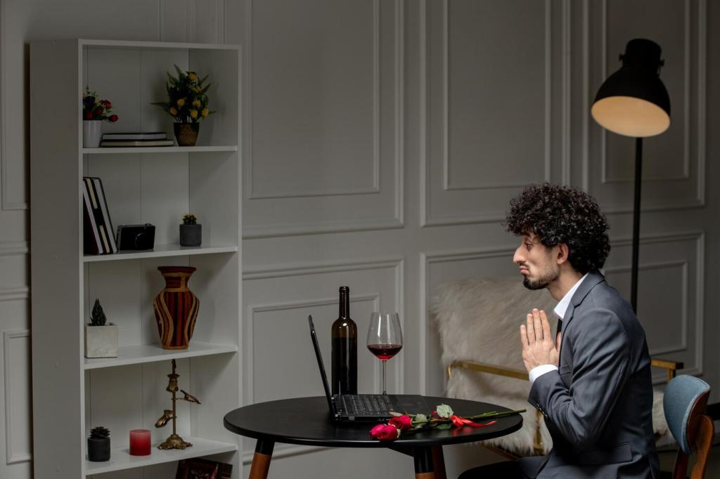

Room-by-Room Color Play
Layer three values of one hue for harmony: pale greige walls, medium taupe sofa, and deeper mocha accents. Add a restrained pop like rust or teal in pillows. Upload a photo of your living room and we’ll suggest a two-color refinement to tighten the palette.
Room-by-Room Color Play
Two-tone cabinets feel contemporary: warm white uppers with olive, inky blue, or espresso lowers. Match undertones to counters and backsplash. Hardware in brushed brass adds warmth. Comment if you’ve dared dark lower cabinets—what undertone did you choose and how does it handle morning light?